Norden Basic
Client
Services
Industry
Year
Norden Basic entered a highly competitive market where visual differentiation is critical. With countless streetwear and minimal utility brands emerging, the biggest challenge was creating a brand identity that felt instantly memorable while staying true to the brand’s restrained, utilitarian ethos.
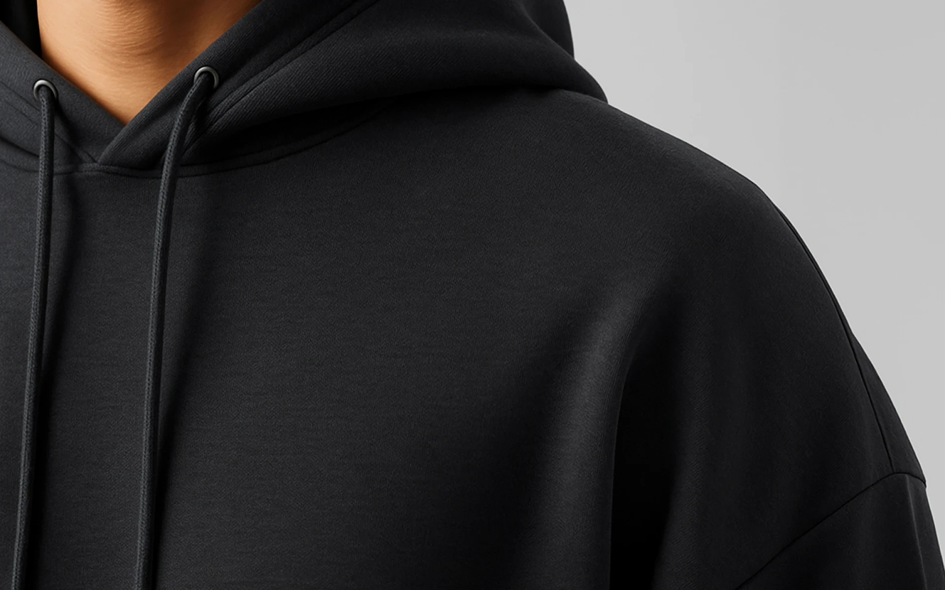
Moreover, the client had a clear vision for tone and material use—earthy tones, strong textures, and a muted voice—but struggled to translate that into a cohesive brand system. There was no logo, no established typography, and no foundational visual language to build on.
I worked closely with the founder to distill the essence of Norden Basic into a clean, modern identity system that could live across apparel, digital platforms, and packaging. We focused on building a brand that communicated strength without noise—through simplicity, proportion, and texture.
This included:
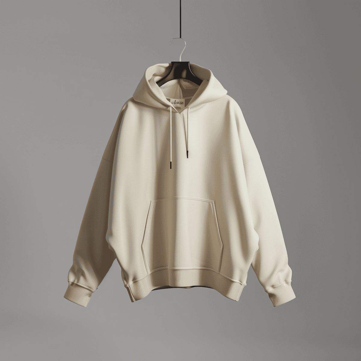
A custom wordmark inspired by Nordic geometry
A compact brand symbol usable in embroidery and patches
A neutral, muted color palette with off-black, sand, and forest green
Functional typographic system using mono and grotesque sans
Mockups for labels, hangtags, and social media previews

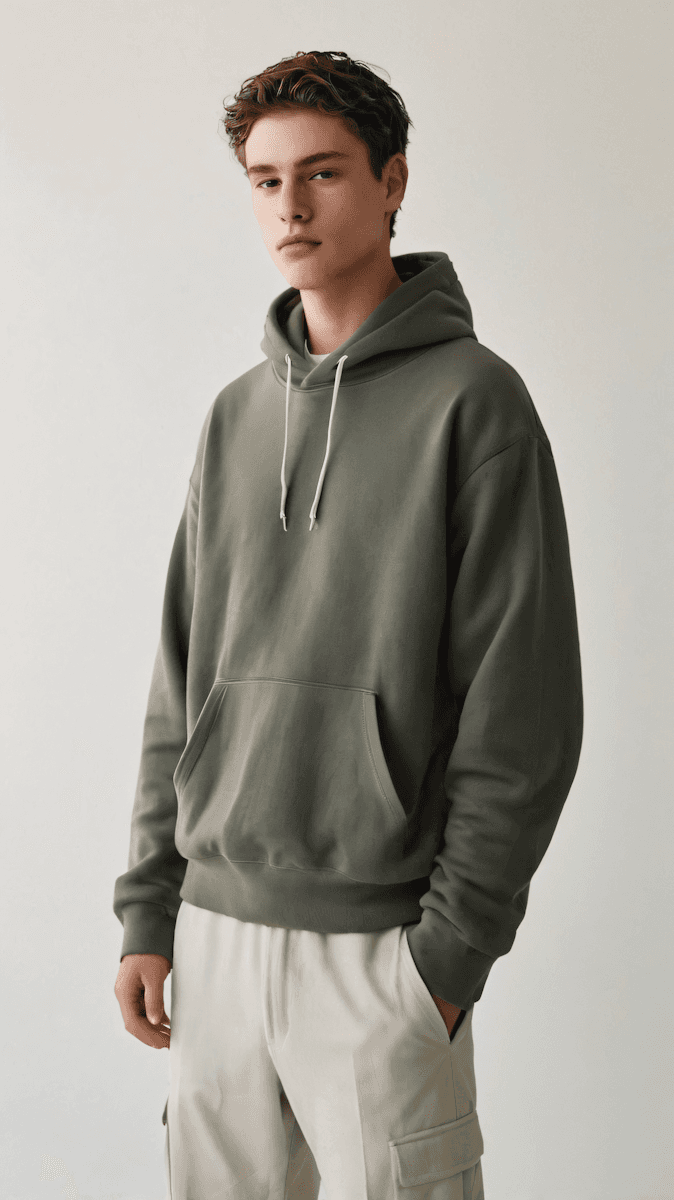
The rebrand positioned Norden Basic as a premium yet grounded utilitywear label. The visual system helped launch its first product collection with a consistent, elevated presence—leading to strong early traction on social media and a fully funded pre-order campaign within the first 3 weeks of launch.
"I highly recommend Daren for brand visual identity development. He pays attention to detail at every step of the project"